crisis_alert
Project overview
A developer platform doesn't fail all at once — it accumulates. After 50+ tools, engineering leadership at Ocado Technology recognised that the platform had outgrown its documentation. Good documentation wasn't a nice-to-have anymore — it was the difference between developers using the platform well and working around it.
crisis_alert
Problem
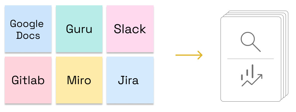
Documentation was scattered,
across dozens of locations — different file formats, different structures, no consistent ownership
across dozens of locations — different file formats, different structures, no consistent ownership
Valuable tribal knowledge existed,
written by developers themselves, but buried and invisible to most
written by developers themselves, but buried and invisible to most
Quality was uneven,
some documentation was outdated, some just wasn't good
some documentation was outdated, some just wasn't good
Developers were using the wrong tools,
not out of habit, but because they didn't know better options existed
not out of habit, but because they didn't know better options existed
No usage data existed,
no way to know what was being read, ignored, or missing
no way to know what was being read, ignored, or missing
mountain_flag
Project goal
Give developers one place to find what they need — and give the platform team the visibility to know whether it was working.
Consolidate everything into a single,
managed documentation monorepo, reviewed and maintained by a technical committee
managed documentation monorepo, reviewed and maintained by a technical committee
Track usage from the start,
so the team could see what was working and what wasn't
so the team could see what was working and what wasn't
Organise content around jobs to be done,
helping developers find the right tool for the job, not just the one they already knew about
helping developers find the right tool for the job, not just the one they already knew about
person_book
My responisbiities
01. Research
02. Information Architecture
03. UI Design
04. Usability tests
05 Data analysis
content_paste_search
01. Research
To understand what good documentation looks like from a developer's perspective — and what was concretely broken — we ran around 10 in-depth interviews with developers across different departments. We focused on three research goals:
Understand what makes developer documentation genuinely useful — what works, what doesn't, and what good looks like outside Ocado
Identify what was broken, missing, or confusing in the current documentation
Understand how developers think about platform tools — to find out whether the existing structure matched their mental models
wb_incandescent
Research findings
Developers were missing how-to guides,
practical, task-oriented content that helps you get something done.
practical, task-oriented content that helps you get something done.
Examples were the primary way developers learned,
and there weren't enough of them.
and there weren't enough of them.
Existing content mixed reference material, tutorials, and explanations together without distinction — making it hard to find what you actually needed
Navigation wasn't how people moved through documentation,
Ctrl+F was. People searched for phrases, not categories
Ctrl+F was. People searched for phrases, not categories
No single taxonomy could serve everyone,
developers, data scientists, and devops engineers had different mental models, and forcing one structure onto all of them was never going to work
developers, data scientists, and devops engineers had different mental models, and forcing one structure onto all of them was never going to work
Some developers didn't know certain platform tools,
existed at all — discoverability wasn't just poor, it was failing people silently
existed at all — discoverability wasn't just poor, it was failing people silently
account_tree
02. Information architecture
The research findings pointed to four separate problems that needed four separate solutions.
Search
Developers were already using Ctrl+F — they searched for phrases, not categories. A strong search experience meets every mental model where it is, without requiring users to learn a taxonomy first.
Developers were already using Ctrl+F — they searched for phrases, not categories. A strong search experience meets every mental model where it is, without requiring users to learn a taxonomy first.
Category structure
Rather than imposing a user-facing taxonomy, we ran a card sorting session with three internal platform experts — the people with the deepest knowledge of how the platform was actually built. We gave them cards with tool names and asked them to group the tools and explain their reasoning. The categories came from the inside out, not from assumptions about how users might think.
Rather than imposing a user-facing taxonomy, we ran a card sorting session with three internal platform experts — the people with the deepest knowledge of how the platform was actually built. We gave them cards with tool names and asked them to group the tools and explain their reasoning. The categories came from the inside out, not from assumptions about how users might think.
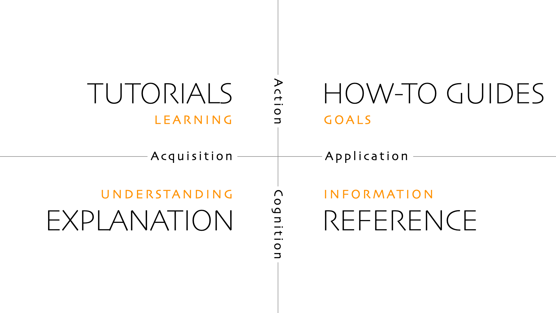
Documentation structure
We adopted the Diataxis framework, separating all documentation into four distinct types: tutorials, how-to guides, reference, and explanation. Each serves a different user need, and keeping them separate solved the mixed-content problem the research had surfaced.
We adopted the Diataxis framework, separating all documentation into four distinct types: tutorials, how-to guides, reference, and explanation. Each serves a different user need, and keeping them separate solved the mixed-content problem the research had surfaced.
How-to guides (Use case)
Structured around jobs to be done. We named guides after developer intent, not implementation. Not "use the API Gateway wrapper" — but "expose resources outside the account." Jobs don't change even when the tools underneath them do.
Structured around jobs to be done. We named guides after developer intent, not implementation. Not "use the API Gateway wrapper" — but "expose resources outside the account." Jobs don't change even when the tools underneath them do.
mobile_layout
03. UI Design
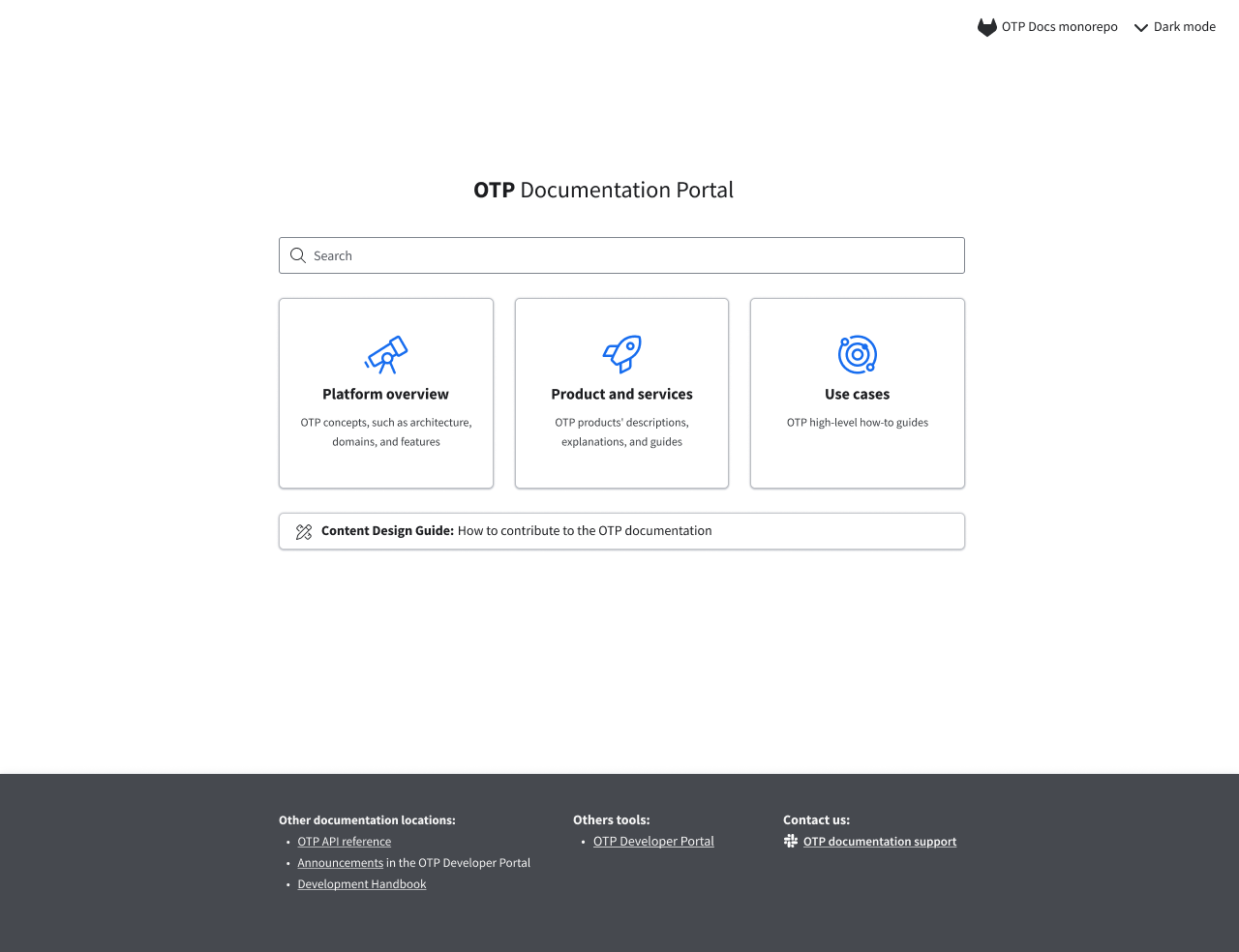
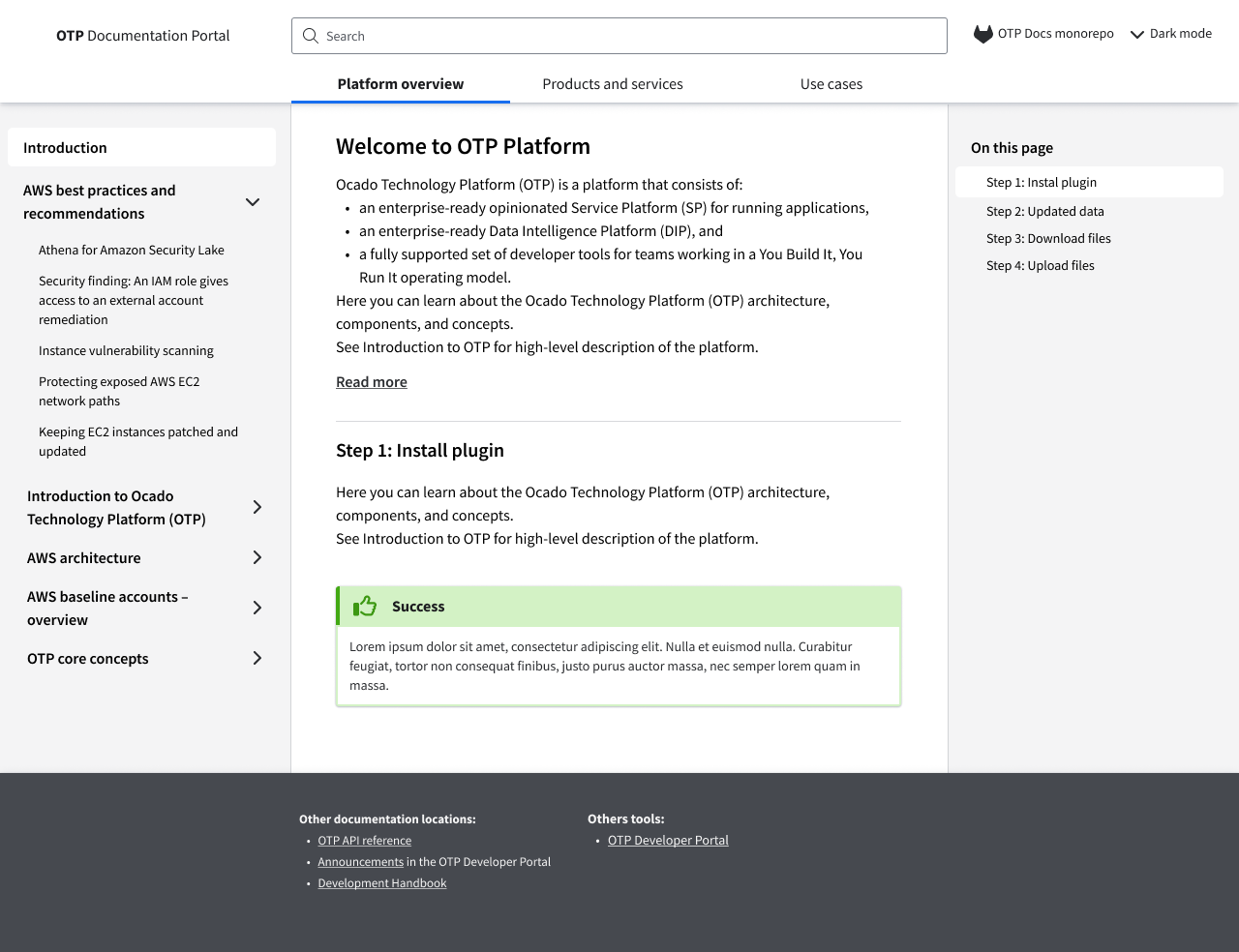
The platform was built on MkDocs with the Material for MkDocs theme as the foundation — chosen because it gave us a solid, developer-familiar base to build on rather than starting from scratch.
The design work had three distinct parts.
The design work had three distinct parts.
Visual customisation
I adapted the Material theme to the internal brand end-to-end: defining colour tokens, adjusting typography, and directing the front-end implementation. Mermaid diagram support was added for technical documentation. The Figma prototype built for validation was based on this adapted theme.
I adapted the Material theme to the internal brand end-to-end: defining colour tokens, adjusting typography, and directing the front-end implementation. Mermaid diagram support was added for technical documentation. The Figma prototype built for validation was based on this adapted theme.
Search design
Search wasn't left to defaults. We customised Lunr.js to control how content was indexed, what appeared in search results, and what ranked at the top. The goal was a search experience that met developers where they were — surfacing the right content without requiring them to know the platform structure first.
Search wasn't left to defaults. We customised Lunr.js to control how content was indexed, what appeared in search results, and what ranked at the top. The goal was a search experience that met developers where they were — surfacing the right content without requiring them to know the platform structure first.
Contribution workflow
Documentation contributions were connected to GitLab, giving developers a familiar way to submit content and giving the technical committee a structured approval process before anything went live.
Documentation contributions were connected to GitLab, giving developers a familiar way to submit content and giving the technical committee a structured approval process before anything went live.
list_alt_check
04. Usability test
Before rolling out platform-wide, we tested on a single piece of documentation first — the API Gateway wrapper — chosen because it was well understood and had real potential users we could recruit.
Documentation structure
Built a scenario around a job to be done: expose a resource outside the accountDevelopers used the documentation to complete the task, thinking aloud as they wentWe were validating one thing: was the documentation complete and clear enough to get the job done?
Built a scenario around a job to be done: expose a resource outside the accountDevelopers used the documentation to complete the task, thinking aloud as they wentWe were validating one thing: was the documentation complete and clear enough to get the job done?
Search
Tested separately on a working product with a small group of users before launch
Tested separately on a working product with a small group of users before launch
Categories
The platform launched initially without categorisation focused on tools, products, services, and searchCategorisation was introduced as an ongoing process after launch
The platform launched initially without categorisation focused on tools, products, services, and searchCategorisation was introduced as an ongoing process after launch
finance_mode
05. Data analysis
We used FullStory to track behaviour before and after the redesign — establishing a baseline of how developers entered and moved through documentation, and monitoring for changes post-launch.
Search behaviour
What developers were typing — tool names, job names, or something else entirely
Which searches returned no results — pointing to content gaps or indexing problems.
What developers were typing — tool names, job names, or something else entirely
Which searches returned no results — pointing to content gaps or indexing problems.
Content performance
Most viewed documentation — what was being used heavily
Zero view documentation — what was invisible or irrelevant
Scroll depth — were developers reading or skimming
Most viewed documentation — what was being used heavily
Zero view documentation — what was invisible or irrelevant
Scroll depth — were developers reading or skimming
Engagement
Returning users — were developers coming back, suggesting the documentation was useful
Time on page — were people reading or landing and leaving
Returning users — were developers coming back, suggesting the documentation was useful
Time on page — were people reading or landing and leaving
Most view
Most view
Most view
cognition_2
What I learned?
Documentation is a product,
it needs ownership, structure, and measurement like any other
it needs ownership, structure, and measurement like any other
The best design decisions on this project didn't come from me,
they came from domain experts who understood the platform deeply. My job was to create the conditions for that knowledge to surface
they came from domain experts who understood the platform deeply. My job was to create the conditions for that knowledge to surface
One taxonomy can't serve everyone,
when your users have fundamentally different mental models, search is more democratic than structure.
when your users have fundamentally different mental models, search is more democratic than structure.
Most view
Most view
Most view